At first I decided to the computer doctors, but there were other logos that stole my idea or emulated it already. So I decided to research logos that have been redesigned and found Netgear had a plain logo. I was doing Netgear at first but then I remembered its competitor D-Link had a plain logo too. I decided to go with D-Link because I had a better idea for it.
|
Today, I looked up bad logos to recreate. I think I may do the computer doctor because I have an idea for it. I hope to follow through with this next class.
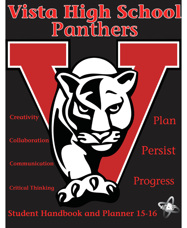
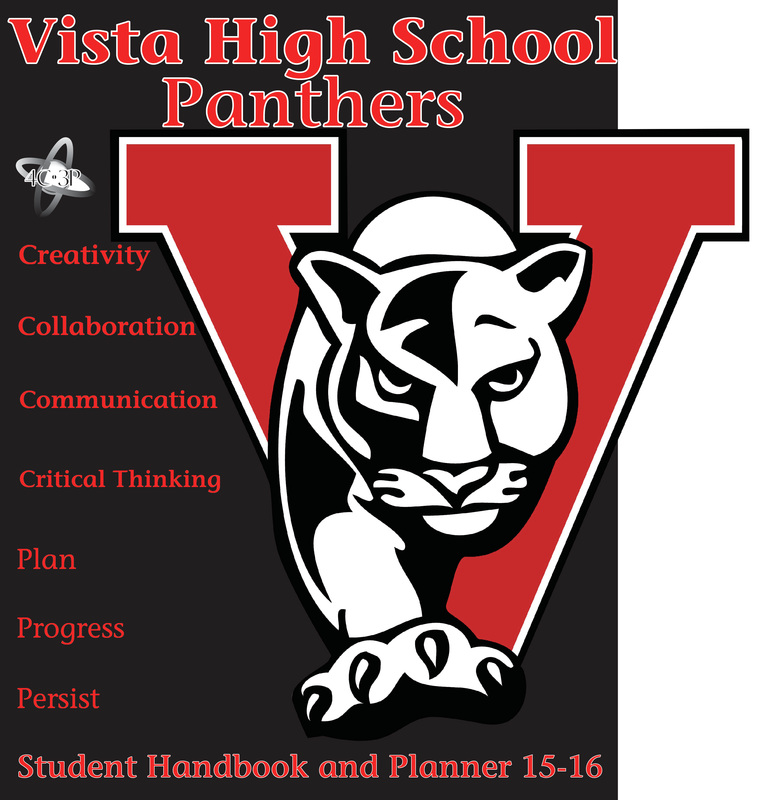
I chose to work on the student handbook because it interested me the most out of all the choices given. I used red and black primarily to convey the main colors of our high school. Personally the typography looks like it could be on a handbook so I chose it. I could have went with other options. I used color to represent the school colors. I used balance for the 4c3p words. As you can see, they all align. I am most proud for what finishing the student handbook. I could have improved on not getting the 3Ps wrong. I sort of blame it on you for not putting a comma after "persist and progress" and a period after "Critical Thinking Plan" so I thought it was Critical Thinking Plan then Persist and Progress. But, it was also my fault I didn't use common sense. I kept asking why it was called 3P too. Anyways, I had to go back and refix it for all my versions. |
AuthorWrite something about yourself. No need to be fancy, just an overview. Archives |
 RSS Feed
