At first I decided to the computer doctors, but there were other logos that stole my idea or emulated it already. So I decided to research logos that have been redesigned and found Netgear had a plain logo. I was doing Netgear at first but then I remembered its competitor D-Link had a plain logo too. I decided to go with D-Link because I had a better idea for it.
|
Today, I looked up bad logos to recreate. I think I may do the computer doctor because I have an idea for it. I hope to follow through with this next class.
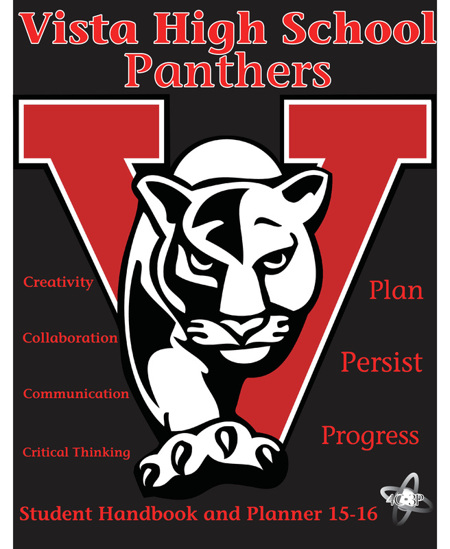
I chose to work on the student handbook because it interested me the most out of all the choices given. I used red and black primarily to convey the main colors of our high school. Personally the typography looks like it could be on a handbook so I chose it. I could have went with other options. I used color to represent the school colors. I used balance for the 4c3p words. As you can see, they all align. I am most proud for what finishing the student handbook. I could have improved on not getting the 3Ps wrong. I sort of blame it on you for not putting a comma after "persist and progress" and a period after "Critical Thinking Plan" so I thought it was Critical Thinking Plan then Persist and Progress. But, it was also my fault I didn't use common sense. I kept asking why it was called 3P too. Anyways, I had to go back and refix it for all my versions. I learned about the basics of Indesign CS6 and the most frequent things beginners ask. I simply learned how to fit images, scale images, changes spacing of text, accessing bridge within Indesign CS6, using minibridge, wrapping images, and the paragraph tool.
The image in the front cover is the family in Little Women. I liked the text because its sort of a Civil War text. I used the pink background because its a women-like color. I used pattern by having the borders on both the front and back cover. I used color to create a background for the book cover. I used line to create the borders. I am proud of what I came up with. I could improve on the spacing of the text of this book cover. 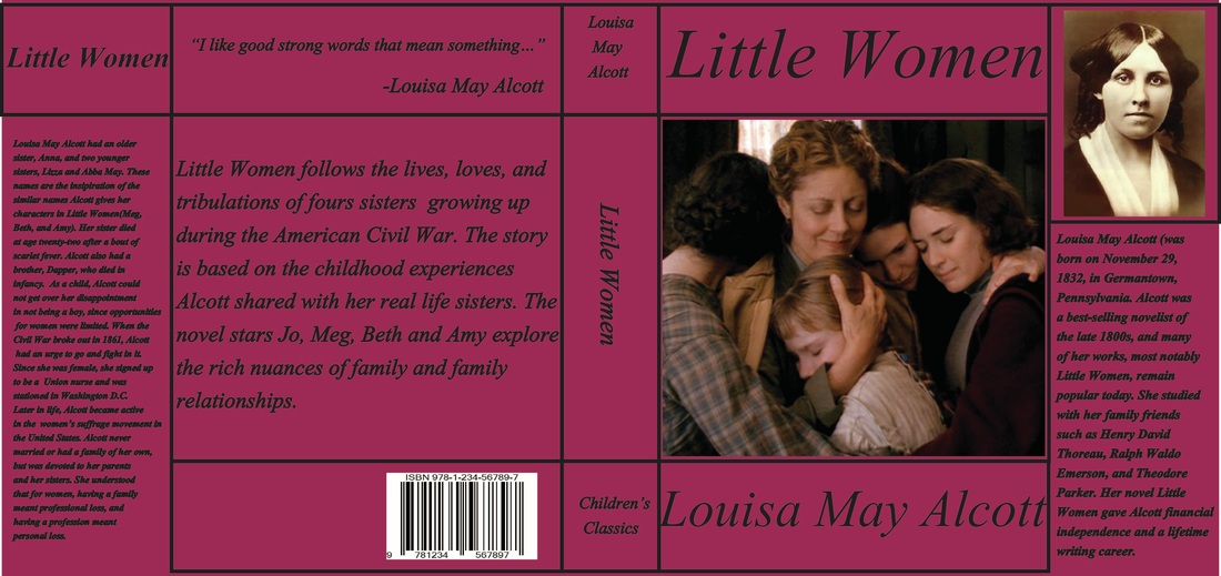 My book cover still has a lot of work to do. I am currently working on layer masking part of the cover. I will see how the cover is, and make a few tweaks. I still don't know if the front cover picture will be the front cover picture because of the white background of it. I was thinking of changing the book color to white, but it makes it like one of those old children books. I need some feedback from you before I finalize it.
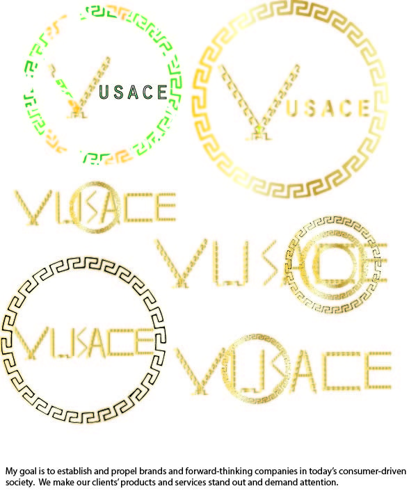
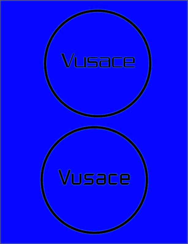
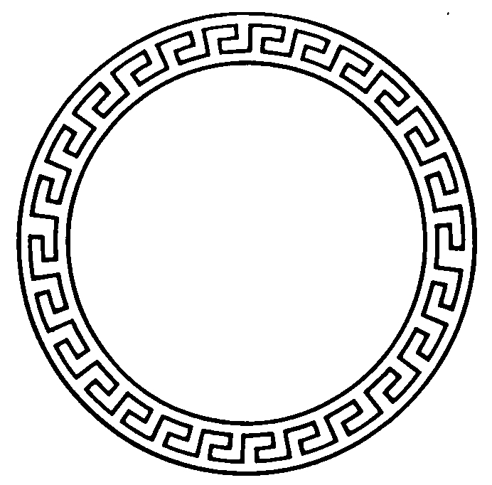
I selected my design studio name based on creativity. My logo represents the aesthetic appeal and creativity my design studio will have in order to propel brands forward. I used the border of Versace logo and flipped it to represent the kind of opposite of Versace. Personally, my logo still needs some fixing, but my logo will engage customers into thinking that all of Vusace's work will be gold. There's also a little gold trophy in the middle of the V to represent that we are #1, and theres a podium. I learned how to get the gradient for gold and change it how I like. I had a problem picking a design, after feedback from classmates and Ms.Mckay, I decided to make the logo. The design changed quite often, I had many versions of the logo. It went from a simple font change to what it is now. My Design Studio name is Vusace. My name is inspired from a well-known fashion brand called Versace. I chose this name because it is a creative and cool name. It shows that as a design studio, I am creative and can make cool, excellent work of art.My goal as a design studio is branding and marketing. My fonts are inspired by the pattern of the outer border of the Vusace logo. For one of them, I just decided to go kind of simple and put a temporary blue background. I only did one letter of my whole design studio name because it was taking longer than I thought. I might try some hidden symbolism, if I can. Brett came in today to talk about the Chamber of Commerce. The Chamber of Commerce has a body of 575 people. The branches of the Chamber of Commerce consists of the government, education, non-profit organizations, business(for-profit) organizations, and public safety. All the branches go through the Chamber of Commerce. The "Heroes of Vista" are recognized for excelling in whatever they do. Each branch has a fixed number of awards. Education has four and business started off with four. The business branch received more people and change the number of awards to increase business. The problem with the awards is that not every "Hero of Vista" receives full recognition for his/her work., only the winner receives full honor. Through design, we can potentially make a brochure that includes each and every persons' name and a little summary about them. Also, we could make a poster for each and every person. The easiest way to solve this problem is to simply make a full video for each and every person, but the time constraint is most likely the problem. You could make a shorter video for each and every person. Since it's called "Heroes of Vista," I assumed each and every person is a winner.
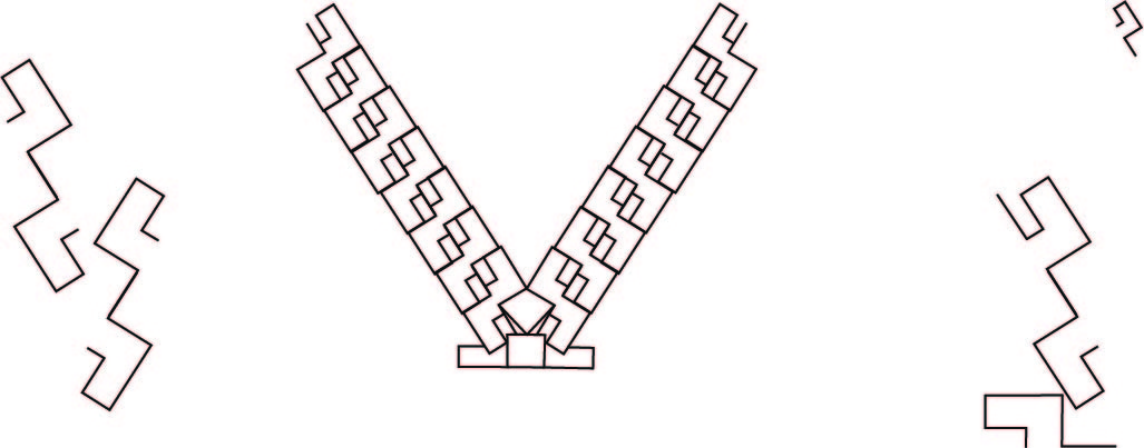
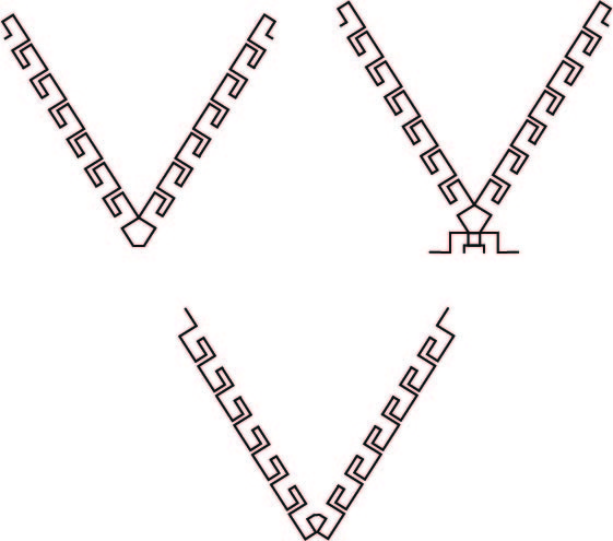
Today, I researched symbolism in logos and how simple logos can be better. I came up with mostly simple logos, so that people can recognize my logo. I also created a more complex design using the pattern of the Versace logo. I was also thinking of reversing the pattern of the Versace logo to represent that I'm the opposite of it. Right now I am leaning towards a simpler logo. Also, I completed my design studio template.
|
AuthorWrite something about yourself. No need to be fancy, just an overview. Archives |
 RSS Feed
